
Today’s post is a highlight of Good News from my super fact blog, which I call Superfactful. I am listing eight posts, seven of which are what I call super facts. A super fact is a fact that is important, not trivia, and that is known to be true and yet are either disputed by large segments of the public or highly surprising or misunderstood by many. The super facts included with this post are what you can call Good News. Surprising news, perhaps shocking news, but still good news.
Peace Is Boring News
The first and my most recent post is not a super fact but my musings on the fact that good news tends to be boring news and therefore forgotten.
To visit the Peace is Boring News page click here

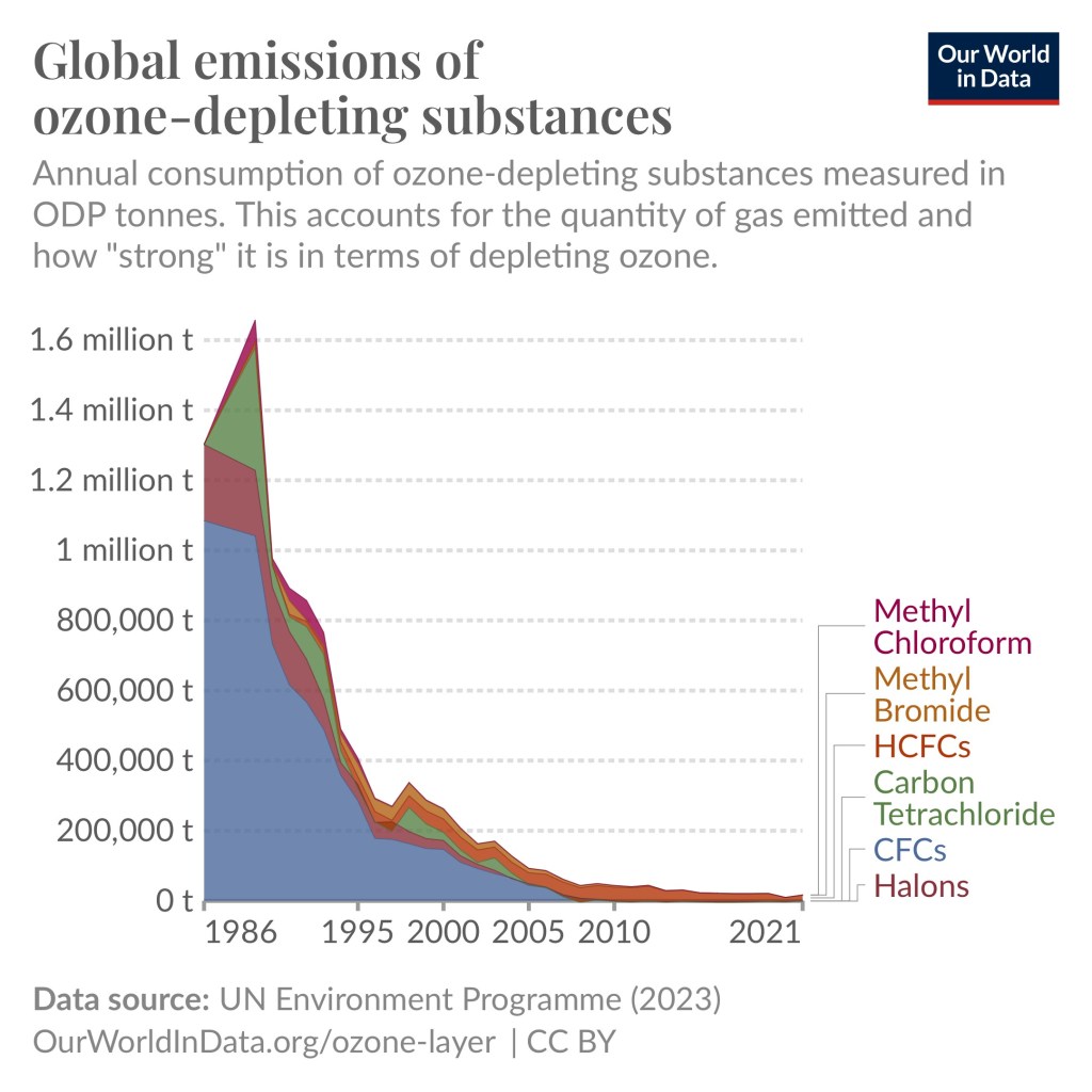
Emissions of ozone-depleting gases have fallen by 99 Percent
Super fact 41 : Largely thanks to the Montreal Protocol in 1987 the emissions of ozone-depleting gases have fallen by more than 99%, 99.7% to be exact, according to Our World in Data. This has resulted in halting the expansion of the ozone holes and the reduction in emissions of ozone-depleting gases is saving millions of lives every year.
To visit the page for Emissions of ozone-depleting gases have fallen by 99 Percent click here.
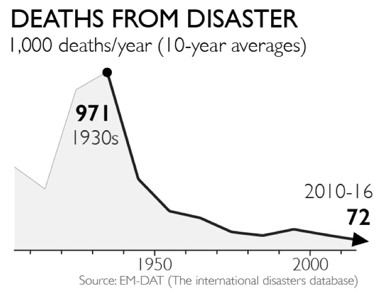
Natural Disasters Kill Less People Now Than 100 Years Ago
Super fact 35: Natural disasters kill a lot less people now compared to 100 years ago. That is despite a larger population and despite the fact that climate change has increased the frequency and intensity of many types of natural disasters.
The explanation for this is that we have become much better at warning people, preventing deaths and rescue people.
To visit the page for Natural Disasters, Kill Less People Now Than 100 Years Ago click here
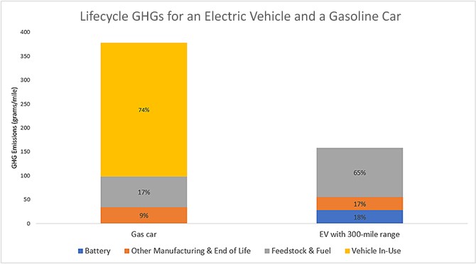
EV Cars Indeed Emit Less Carbon Pollution
Super fact 29: EV Cars emit less pollution than Internal Combustion Engine, even considering manufacturing, disposal and EV Cars being charged by dirty grids.
To visit the page for EV Cars Indeed Emit Less Carbon Pollution click here
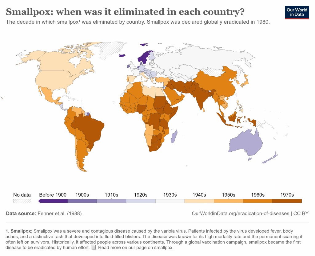
Smallpox Killed 300 million People in the Last Century Before Eradication
Superfact 24: Smallpox killed 300 million people in the 20th century. However, there have been no naturally occurring cases of smallpox since 1977, and the world was declared free of smallpox on May 8, 1980, by the 33rd World Health Assembly.
To visit the page for Smallpox Killed 300 million People in the Last Century Before Eradication click here
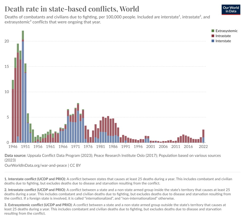
We are living in relatively peaceful times
Superfact 9 : Despite all the wars going on, the world was filled with a lot more war and violence in the past. Despite the grim news reports we are living in relatively peaceful times.
To visit the page for We are living in relatively peaceful times click here
US Violent Crime Nearly Cut in Half Since 1990
Superfact 8 : Despite all the news reports about rampant crime, the US violent crime rate has fallen to half of what it was in the early 1990’s.
To visit the page for US Violent Crime Nearly Cut in Half Since 1990 click here

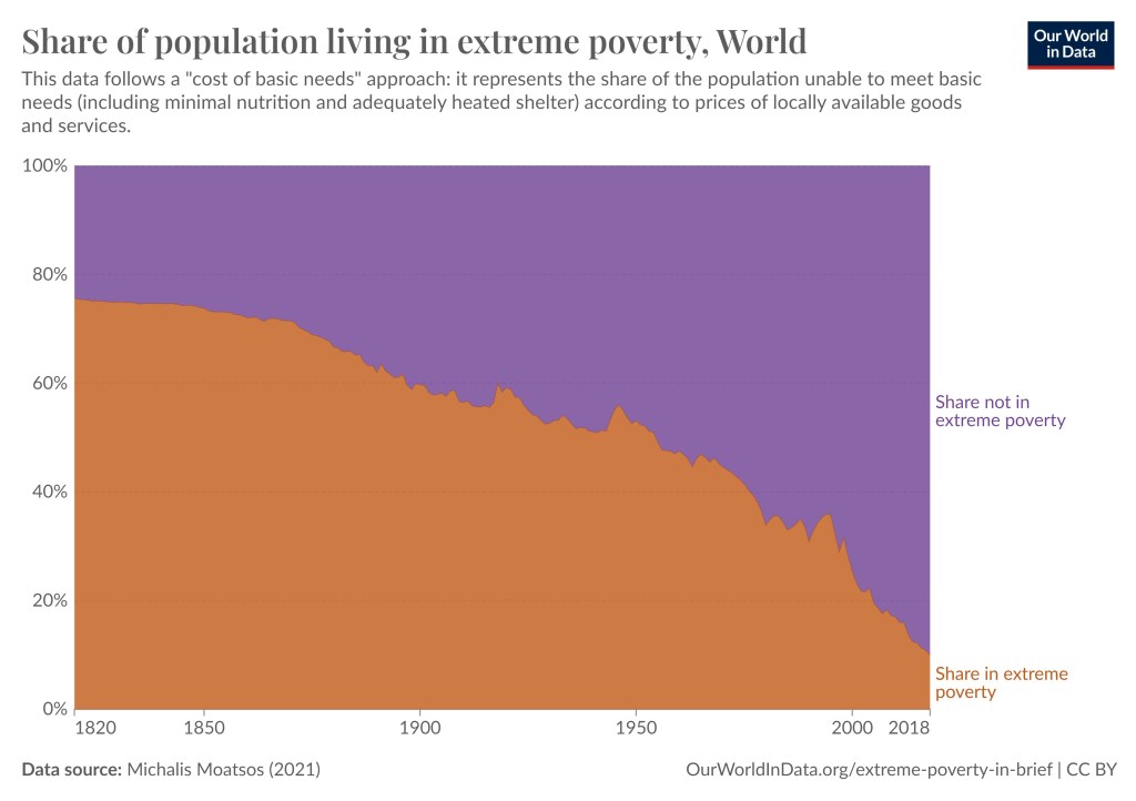
Poverty and child mortality has been sharply reduced worldwide
Superfact 7 : Extreme poverty as well as child mortality has been sharply reduced the world over. The countries that are the worst-off today are still better off than the countries that were doing the best at the beginning of the 19th century. Over the last 50 years extreme poverty and child mortality has continued to decline sharply.
To visit the page for Poverty and child mortality has been sharply reduced worldwide click here
If you have not subscribed to my super fact blog you are certainly welcome to.
